Designing a trustworthy on-demand developer marketplace
for live mentorship and freelance projects.
Codementor is the world's largest developer community for live mentorship with
300,000 developers and 9000 vetted experts. Backed by Techstars & 500 Startup.
CHALLENGE
Help frustrated user finds a "right" mentor to solve their coding problem effortlessly.
DELIVERABLE
✔︎ An optimized chatroom, interactive on-onboarding, and polished top funnel pages.
✔︎ Launched Codementor 2.0 on Product Hunt
OUTCOME
✦ Improved conversion rate by 20% by optimizing end-to-end matching experience
✦ Increased new user NPS rate by 15% by refining user on-boarding process
ROLE
Lead Product Designer - Research. UX. UI. Prototype
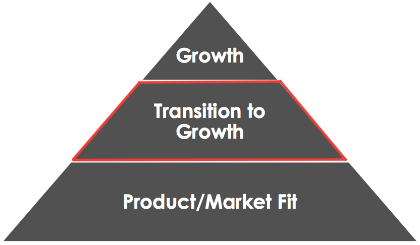
The next move of PMF (Product Market Fit)
In 2014, Codementor officially launched to the public - it has been proved that it’s a great community to help developers connecting and solving the problem together. After three years, the business keeps growing, more users get engaged with Codementor service. Hence, the team thought it was the time to polish the brand more and improve the user experience.
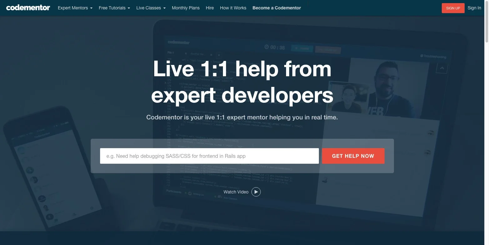
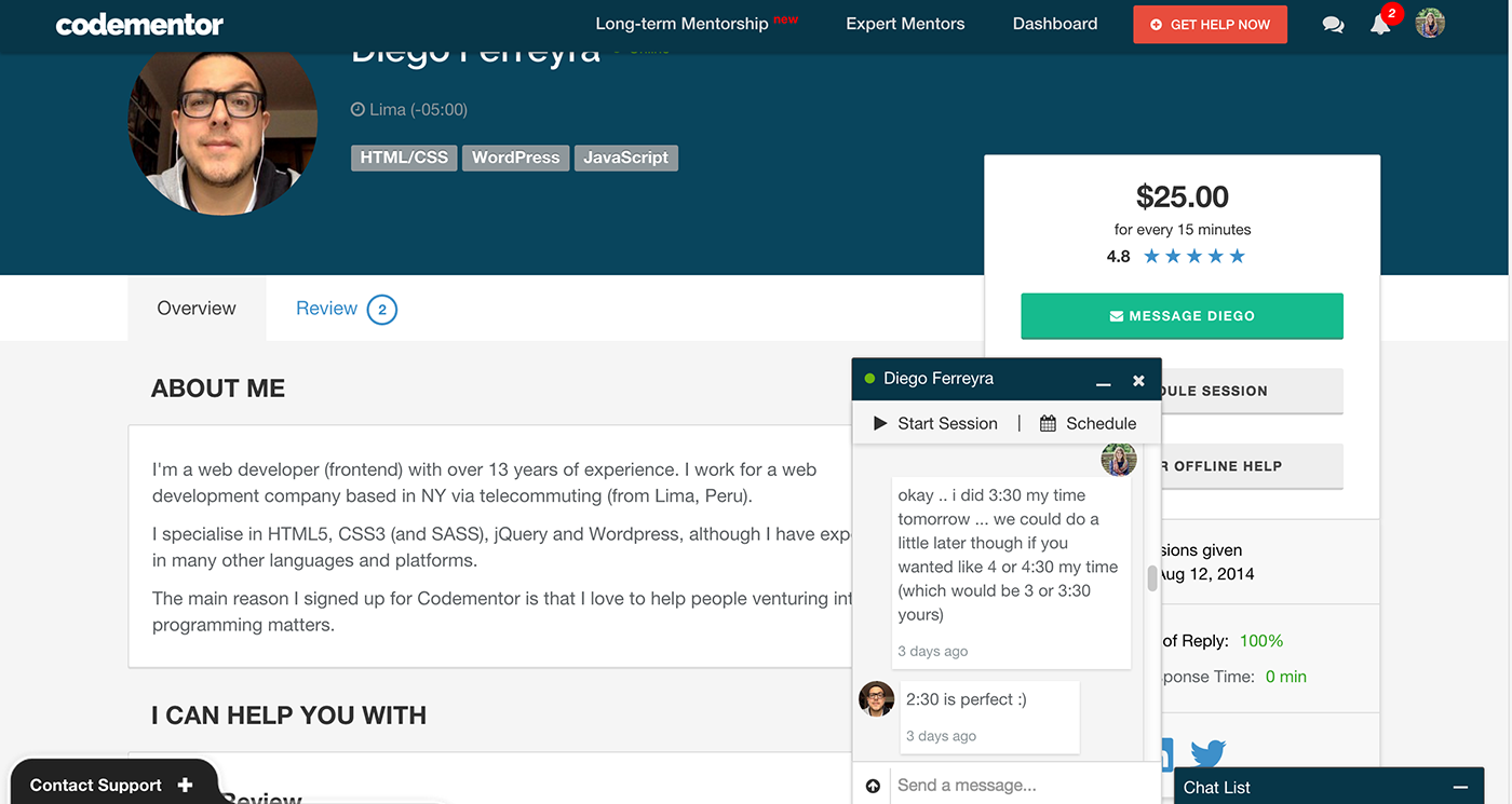
In the early days of Codementor, the landing page and profile page was a bit techie.
Discover the underlying opportunities
Innovation is driven by customer insight, and we can't gain insight without empathy. The very first step, and the centerpiece, of the design thinking process, is to develop empathy with our users. By starting draw out the full spectrum of user journey, I can learn the way they do things and why, their physical and emotional needs, how they think about the world, and what is meaningful to them.
Diving deeper:
Engage users & Observe pattern
To understand the story of our users at a deeply human level. We need to understand our user deeper.
There are two main types of research we use to learn about our users: Engage - User interviews and Observe - NPS Studies. By combing these two research method, give us more holistic user input. The NPS studies were based on a regular quantitative survey in the past year, and I look into the feedbacks to find the pattern. On the other hand, user interviews was a great way to help us ask more question and collect more in-depth qualitative findings.
User interview personas
New User | Hugh
Location: UK
Coding background: Beginner
Status: PHD Student
Goal: Want to be better at coding
Frustration: “I had 2 very unhelpful 'mentors' initially”
Existing User | Franco
Location: Germany
Coding background: Intermediate
Status: Solo Freelancer
Goal: Find extra help for complexed project
Frustration: “(Upwork) As project is done, you cannot keep in touch with the freelancer”
Existing User | Derek
Location: US
Coding background: Advanced
Status: UX professional
Goal: Want to find someone to build a project I'm working on
Frustration: “Sometimes, I REALLY need to implement something but I'm totally stuck…”
NPS pattern synthesis
Framing the point of view
Throughout the deep user research phase, I found an interesting fact is that “Codementor is the last stop of debugging journey.” Our users all came from a path where they already tried tons of possible ways to solve their code problem. Including searching on Google. finding the answer on Stack Overflow. asking engineer friends. But none of them was useful. I and my team spent more time to look into the market, analyzing some freelancing services and our strengths, weaknesses.
Competitors
SWOT Analytics
We found that the unique selling point for Codementor is actually our community-based concierge service. The instant chatting mechanism enables our users to connect with top developers just at their fingertips. However, we know that connecting with the “wrong” mentor will not help the user solve their problem, instead it will even worse. Hence, the next step is to think how can we elevate our brand to convey the mission: Helping users to find the “right” mentor.
Re-brand with a remote team
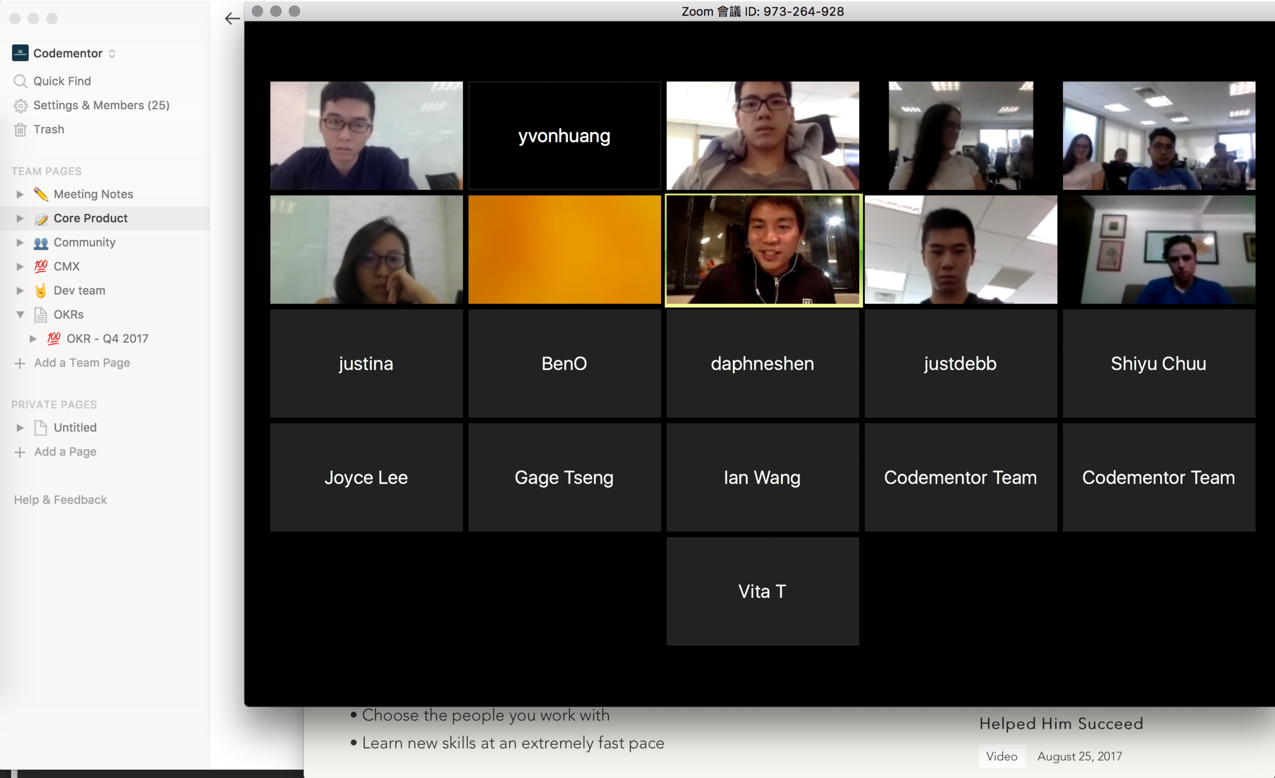
What kind of person do we want to be to show up in front of our user? To align our team member’s idea, I initiate this quick survey to invite our team members to vote for their ideal keyword for the “Codementor personality.” Although our team members work from different counties/timezone - It’s amazing that how quickly we found the consensus. By using the slack integrated vote tool and zoom for open discussion, I can be still proud to say that we move the needle forward quite efficiently. (yay)
Codementor Personality
Professional
Reliable
Friendly
Enthusiastic
Helpful
Building the foundation and system
After finding out the brand personality, the design team starts to explore some new style directions, e.g. a new palette. icon set. avatar illustration style… etc. To build a more unified cross-platform experience, we not just create the style guideline, but a more significant design system. We co-worked with front-end engineer to develop a set of the shared component on Storybook and document every detail in Notion. By doing this, everyone in the team now can access to design library more easily.
Icon library brainstorming with design team
Avatar exploration
New brand palette
New icon library
Using button tile to help us review the cross-platform inconsistency
Building design system on Storybook
The lean UX development process
“Moving fast” is Codementor’s development core spirit. We run quick experiments to help us iterate the design faster. Me and a developer and PM, we worked as a lean development team, starting from a question “ How can we helping users to find the “right” mentor?” We initiated the experiment tasks based on the hypothesis we set for different user segments.
From user segment to action
Unseasoned developers
Seasoned developers
Mentoring
1️⃣ 👨🏼🎓 📚
2️⃣ 👨🏻🏫 🖊
Freelance Job
3️⃣ 🤷🏻♂️ 🙏🏼
4️⃣ 🙋🏽♂️ 💪🏻
Top funnel pages
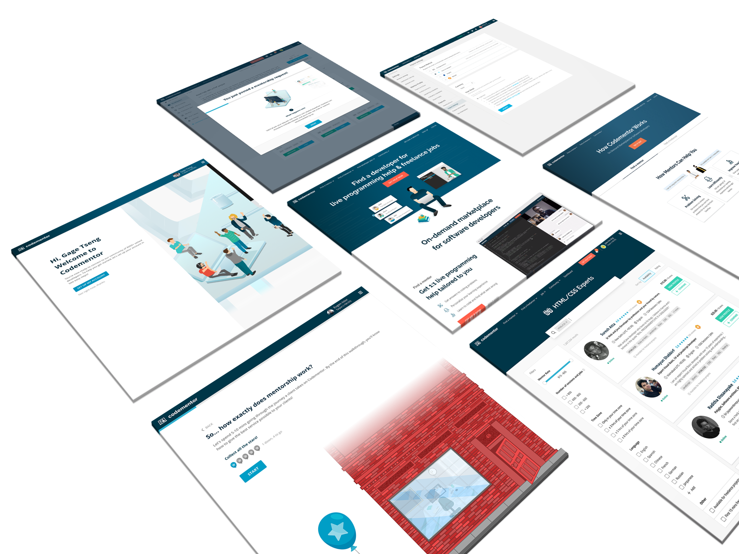
The landing. how it works. expert pages are the key top funnel which helps us linked on search engine result. It also represents as a door front of Codementor community. We want to give our frustrated users a delightful impression, so we turn our brand into a vivid. friendly illustration style to make the brand voice a bit softer - like a good friend is welcoming you home.
Top funnel pages
How it work page revamp
User/Mentor on-boarding
On-boarding process on Codementor is a crucial part. As a two sides marketplace, we not only use the onboarding process as a tool to decrease the learning curve of our user but also manage the supply and demand’s expectation.
Especially for the mentor on-boarding/education, we spent lots of time thinking about how to let our mentor be more patient with new users. Sometimes, it’s hard for an experienced developer to aware that the new code learner’s situation. Hence, we came out an interactive on-boarding experience. The mentor can walk through a simulated scenario and answer the small quiz we gave, from there they will learn tips from our community top developers.
Comparing to original one-page long of instruction passive on-boarding, we have found that our mentor becomes more empathetic once they are done the scenario - this result not just increase our mentor quality but also make the service better, increase our user satisfaction more.
Chat experience
After user and mentor get on-boarded, the chat is where they will connect, the start of a good match. Based on the research, we have found that the chat is a great differentiator for Codementor. None of the other platforms provides this kind of instant chat for mentoring match system. So I helped to improve the chat experience from scratch - redefined the chatroom structure. prioritized the CTAs. designed the new look.
Launch “Codementor 2.0” on Product Hunt
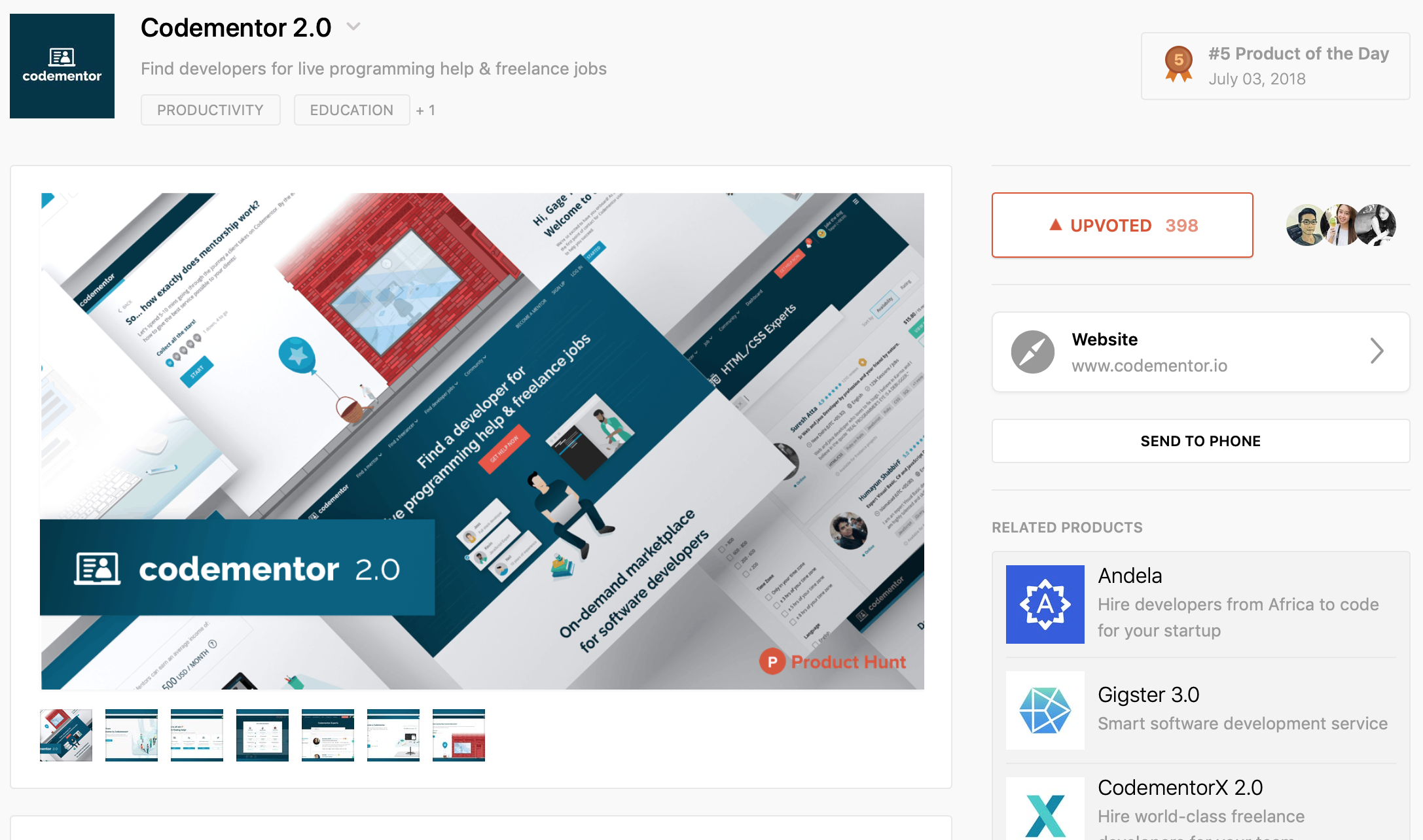
From revamping top funnel pages to optimizing the matching experience, the outcome was significant rewarding. The team successfully reveal our new version of Codementor on Product Hunt, got the top #5 of the day. Increased the conversion rate and new user NPS up to 20%. What’s more is that we learned so much through the lean design process!
Lastly, I want to thanks my team member: PM Amy and Joyce. Developer Eric and Ian who make these happened. Working with an awesome team and hit the goal again and again definitely was the biggest takeaway for me! :)
